Pathways to
Independence
Pathways to Independence is a nonprofit organization dedicated to helping people with developmental disabilities navigate life with dignity and purpose. More so, it’s a social network and support system for people who deserve to go out and thrive but simply lack the tools or confidence to do so.
THE PROJECT
Our client needed a brand and website that would resonate most with the young adults they serve, inspiring a sense of belonging and empowerment. Accessibility by Design best practices were used to create access for all.
A messaging-first approach
Before any design work took place, our content and strategy teams facilitated discovery sessions, which informed a comprehensive messaging strategy. This important work not only established the brand position and key messaging imperatives; it inspired all subsequent content and design work.
- Tone and voice
-
Knowing the brand would need to speak to clients, donors, employees and community partners, the tone and voice were set in the following terms:
- Approachable
- Friendly
- Conversational
- Empowering
- Aspirational
- Sincere
- Messaging platforms
-
We identified three platforms for Pathways to Independence to become the core of our messaging strategy. These inspired all strategic, content and design work for their brand:
Outcomes
- Social and emotional growth
- Creating opportunities to gain independence
- Societal contribution
Connection
- Abundance of relationships
- Structured way to learn/grow
- Sense of belonging/community
Support
- Individualized, personal relationships
- Ability to define/measure progress
- Narrative development
-
We began to shape “the conversation” around Pathways to Independence by creating narratives for each platform. Doing this work early in the project, outside the constraints of specific channels such as ads, web pages, etc., allowed us to be creative while emphasizing the other components of the messaging strategy, such as tone and voice.
For example, the Outcomes conversation might include something like: “Dignity of risk acknowledges that life experiences come with risk. Socializing, and more so, independence comes with risk, and we give participants the courage and confidence to take those risks.”
The Connection conversation might include statements like: “Our environment is a safe and comfortable space for participants to develop communication skills, learn to recognize social cues and participate in and initiate conversations.”
- Brand statements
-
We created both a formal brand position statement to be used as a blueprint for creating marketing communications as well as a “brand promise” to provide a more portable statement for staff use.
Brand positioning statement
Pathways to Independence is the only service provider in St. Louis for structured programs where individuals with complex cognitive disabilities can overcome social challenges to succeed in life’s many paths. Through courses and activities in a safe and supportive environment, participants hone social and interpersonal skills while connecting with others and their community.
Brand promise
We empower individuals with complex cognitive disabilities to make connections that build independent, fulfilling lives.
A humble word doing big things
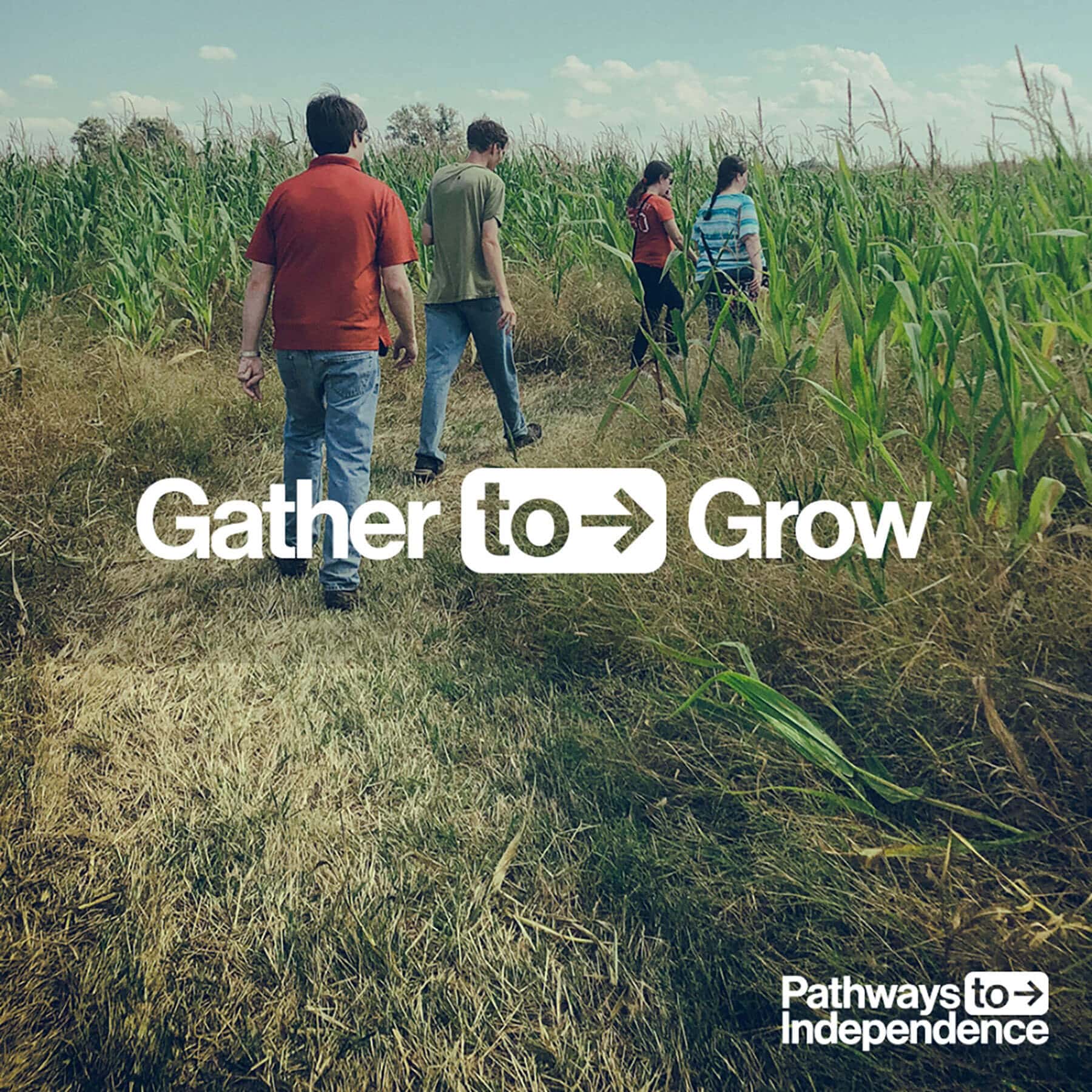
When considering which part of the organization’s name to emphasize, we discovered a hidden gem in the word “to,” which inspired “Here to There” as an expression of the journey a Pathways to Independence member takes. We structured the modular phrase as Verb | to | Goal and designed the logo with the concept of mobility and direction, adhering to our commitment to apply Accessibility by Design best practices. This cultivated a transformational approach to the brand design.
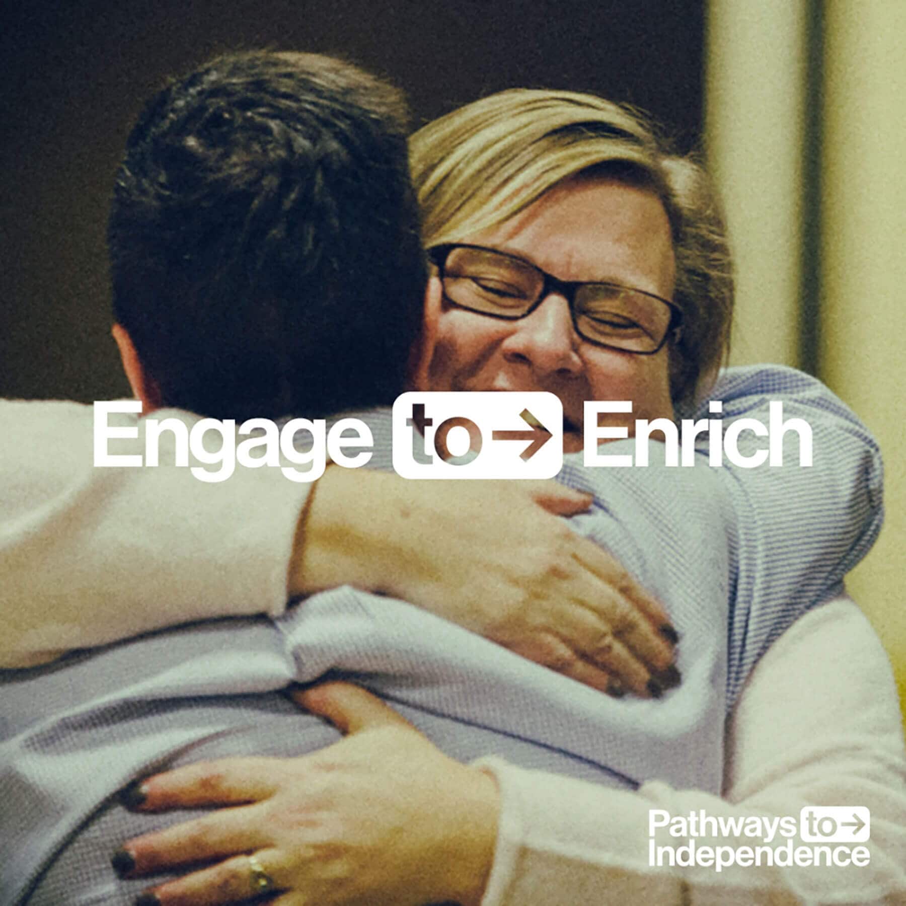
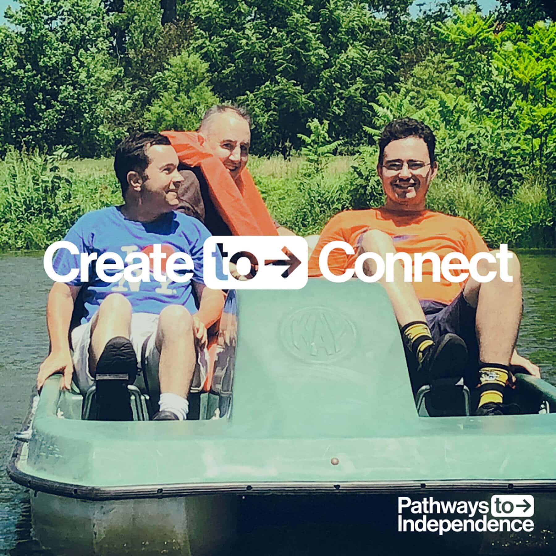
Bold yet inviting
In order to resonate with members, the brand needed to be accessible and look cool. Our team looked to fashion, music and a wide range of other pop genres for design inspiration. The result is a visually stunning brand that’s inclusive, confident and reflective of potential.
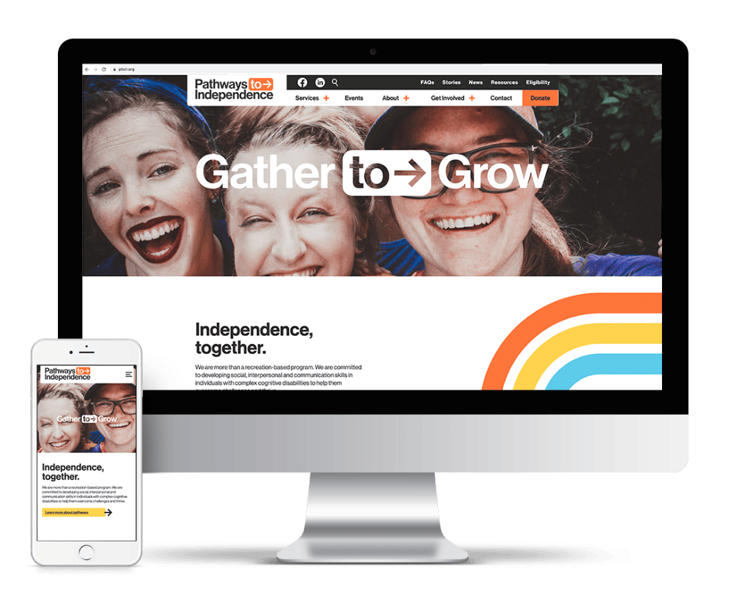
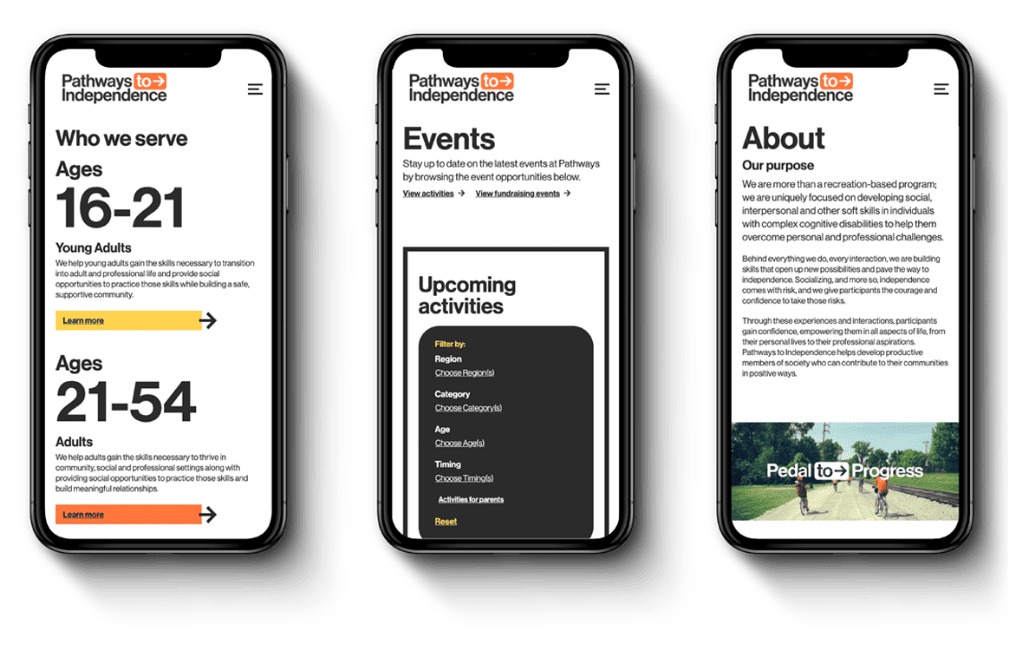
This especially bares out in the highly functional and engaging website we developed — which also met key operational objectives. These included accommodating a new program category for young adults, creating a nimble UX to support further program expansion and developing an interactive activity calendar to promote events and attract new participants.
Staying on the right path
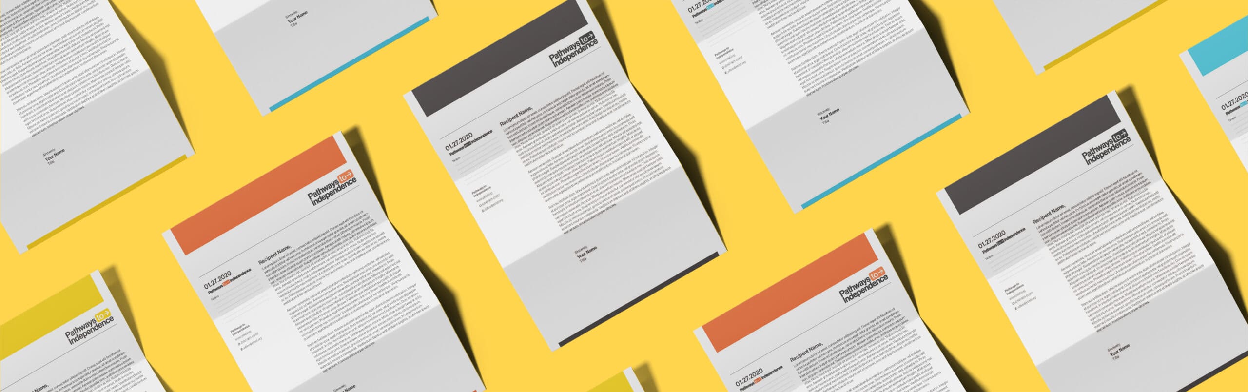
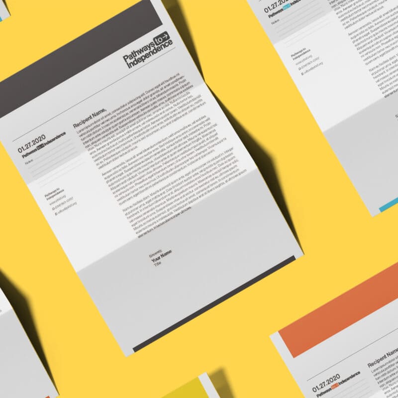
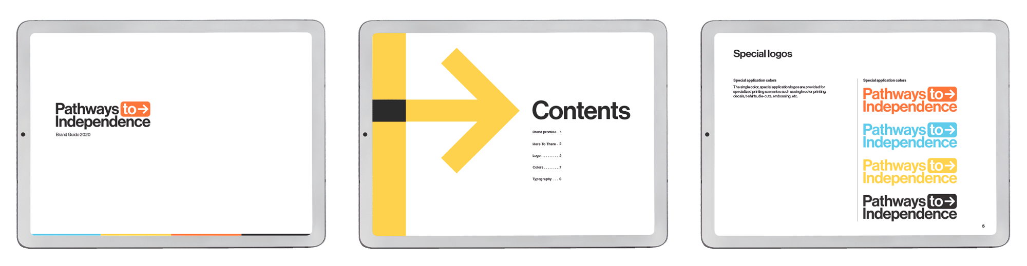
Success for any rebrand depends on how well it is executed beyond the initial launch. We created a comprehensive brand guide with parameters for messaging and design to empower the Pathways to Independence team to publish meaningful communications with ease.


Pathways to Independence helps people with developmental disabilities navigate life. Magnetize created a brand that’s an expression of what’s possible.
Tell us about your project
Whether you’re looking for a new agency to partner with on all of your communications or just need help with a project, we’re ready.